The Language of Motion: How Speed Became the Most Powerful Design Principle of Our Time
Speed has always been a feeling. What's changed is that designers have learned how to manufacture it — and now the visual language of the racetrack is everywhere, from tech launches to fashion editorial to your phone's UI.

There is a moment — fractions of a second long — when a moving object leaves a trace. Not a blur, exactly. Something more deliberate. A suggestion of where it was, and a promise of where it's going.
Designers have been chasing that moment for decades. Today, it's everywhere.
Speed as Aesthetic
We live in an era obsessed with velocity. Not just in racing or technology, but in the way things look. The visual language of speed — streaks, gradients, motion blur, directional tension — has migrated from the racetrack and the wind tunnel into graphic design, branding, architecture, and digital interfaces.
Open any major sports brand's identity system today and you'll find it: lines that lean forward, letterforms with implied momentum, color transitions that feel like they're moving even when they're standing still. It's not accidental. It's a deliberate choice to make the viewer feel something before they've read a single word.
"Static design can still have energy," says creative director Mara Solano, whose studio has worked with three Formula-class racing teams in the last four years. "But the best visual systems today — the ones people actually respond to — they have directionality. They feel like they're going somewhere."
The Physics of Visual Flow
What makes a design feel fast?
It comes down to a few fundamental principles that designers have borrowed, consciously or not, from the physics of motion.
Directionality is the most obvious — lines and shapes that point, lean, or flow in a consistent direction create a sense of forward movement. It's why racing liveries almost universally angle their graphics toward the front of the car. The eye follows the geometry and arrives at the nose, already moving.
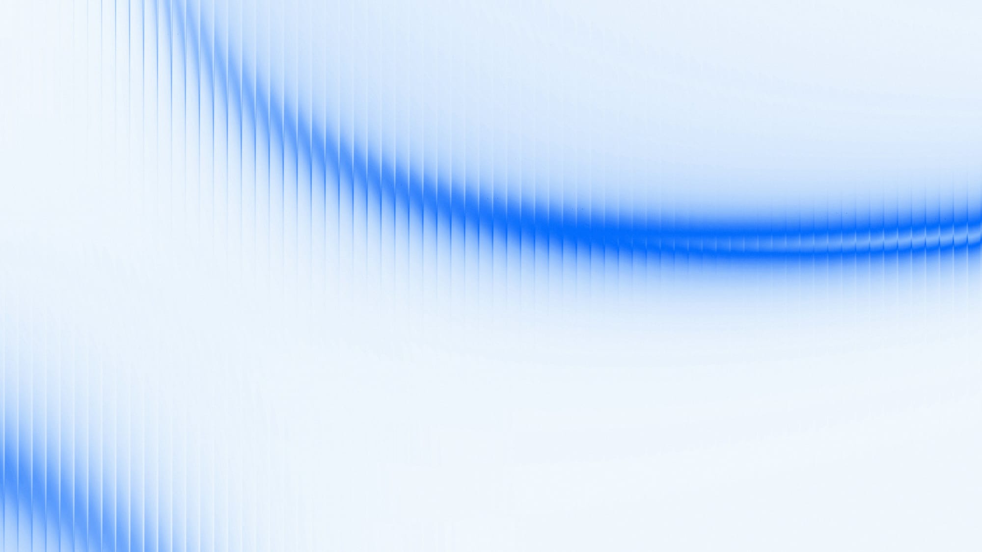
Contrast and blur simulate the visual effect of speed on the human eye. When something moves fast enough, the brain stops resolving detail and starts reading impression. Designers replicate this with deliberate softness — sharp edges that dissolve into gradients, solid forms that bleed into their backgrounds.
Frequency and rhythm — the visual equivalent of engine note. Repeated vertical or horizontal elements, spaced tightly and consistently, create a stroboscopic tension that feels kinetic even on a flat screen. It's the principle behind the aesthetic of carbon fiber, heat fins, and the ribbed surfaces of high-performance machinery.
Put those three principles together and you get something that feels like it's doing 180mph while sitting perfectly still.
From Track to Screen
The crossover between motorsport design and mainstream visual culture is not new — but it has accelerated dramatically in the last five years.
The rise of Formula One as a global lifestyle brand, the explosion of sim racing as a spectator sport, and the growing influence of automotive culture on streetwear and graphic design have all pulled the visual grammar of speed into the mainstream. Brands that have never been near a racetrack are borrowing the language fluently.
You see it in tech product launches — the streak of light across a dark background, the ripple effect implying processing power. You see it in fashion editorial — garments photographed with motion blur as if the model is mid-sprint. You see it in music branding, in architectural visualization, in the UI of financial trading platforms.
Speed, it turns out, is not just a physical property. It's a feeling. And design has learned how to manufacture it.
The Risk of the Language
There's a tension at the heart of this trend that honest designers will acknowledge: the visual language of speed, used carelessly, becomes noise.
When everything moves, nothing is fast. When every brand leans forward, the lean loses meaning. The most effective uses of motion-as-aesthetic are the ones that deploy it with restraint — a single directional element in an otherwise static composition, a carefully placed blur in a field of sharp geometry.
"The danger is when it becomes decoration," Solano says. "Speed in design should mean something. It should tell you something about what the thing does, not just how it wants you to feel. When it's just wallpaper, you've already lost the plot."
What Comes Next
The next frontier, if the early signals are any indication, is haptic and temporal design — motion that exists not just as visual metaphor but as actual time-based experience. Interfaces that accelerate and decelerate. Animations calibrated to feel like weight and friction. Branding that behaves differently depending on how fast you're scrolling.
The goal, as always, is the same one that has driven every aerodynamicist and livery designer and motion graphics artist working in this space: to take something invisible — the feeling of speed, the sensation of forward momentum — and make it something you can see.
The best designs don't just show you fast. They make you feel it.
This article is part of our ongoing series on the intersection of sports culture and visual design.
