The Chair in the Light: Why the Best Interiors Are Designed Around Stillness


There is a particular kind of room that stops you at the doorway.
Not because it's grand. Not because it's expensive. But because something in it is arranged so precisely — so honestly — that walking in feels like an interruption. Like the room was already complete before you arrived.
The secret, more often than not, is a single chair placed in natural light.
Designing for the Pause
Interior design has spent the better part of two decades chasing the new. New materials, new palettes, new silhouettes imported from Milanese showrooms and Copenhagen studios. And there is value in that — the field moves, evolves, responds to culture.
But the interiors that endure, the ones that get photographed ten years after they were completed and still feel current, tend to share a quality that has nothing to do with trend cycles. They are designed around moments of stillness. Around the idea that a room should offer its occupant somewhere to simply be.
"The best brief I ever received was three words," says London-based interior designer Celia Marsh. "'Make it quiet.' Not minimalist, not sparse — just quiet. That distinction changed how I approach every project."
Light as a Material
No element shapes a room more completely than natural light, and no designer worth their fee ignores it.
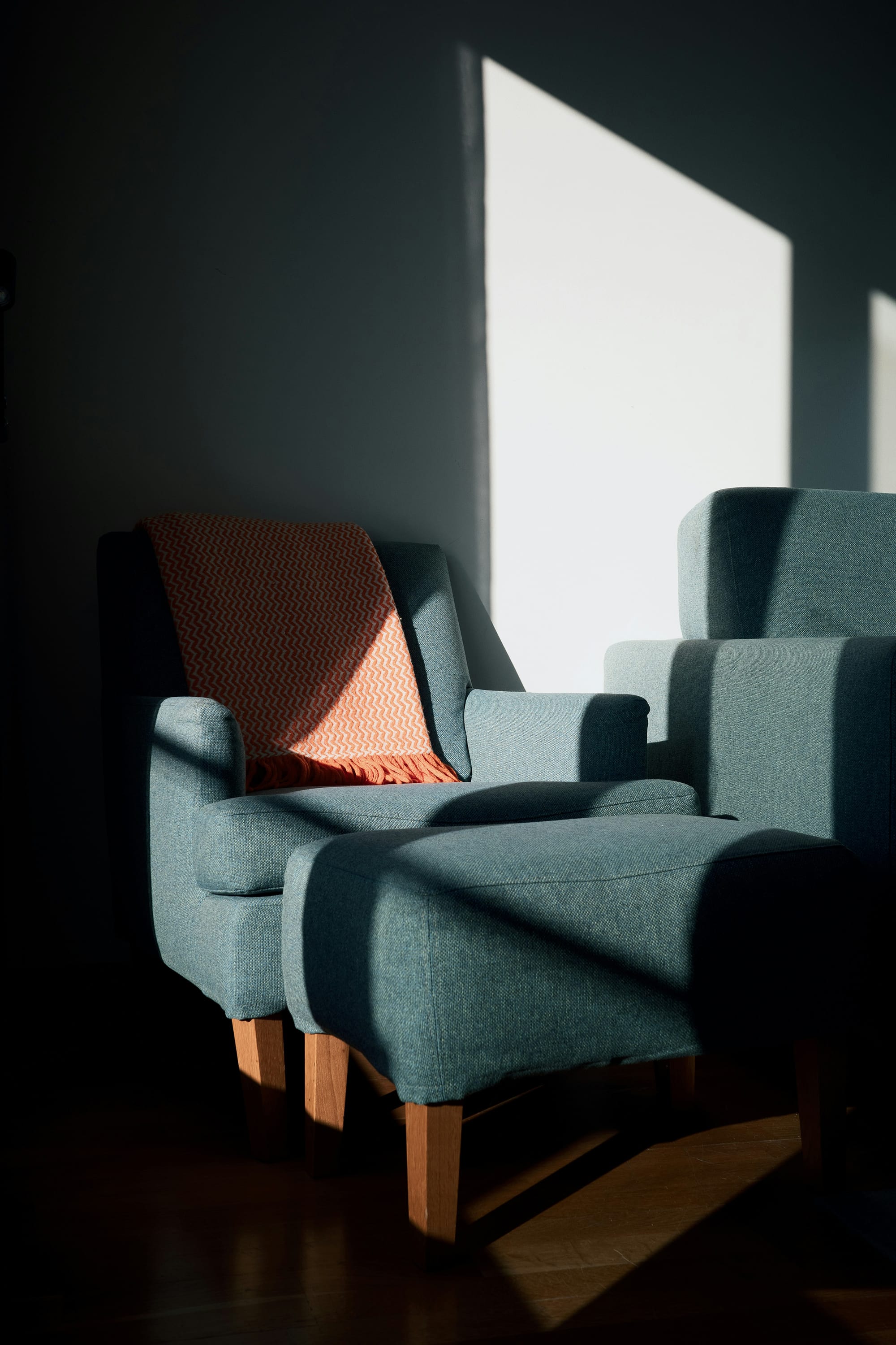
The angle of afternoon sun through a west-facing window. The way a deep window reveal casts a hard-edged shadow across a textured wall. The quality of light in January versus June — softer, lower, longer — and how a room should ideally respond to both.
The best designers treat light as a material in its own right. They position seating to catch it at its most oblique, when shadows are longest and the geometry of a room becomes most legible. They choose upholstery colors that shift under changing light — a fabric that reads grey-blue at noon and nearly green by late afternoon.
"You're not decorating a room," Marsh says. "You're choreographing an experience that changes hour by hour. A chair that looks right at midday might look completely wrong at four o'clock. You have to know your light."
The Armchair as Anchor
Of all the objects that furnish a room, the armchair carries the most psychological weight.
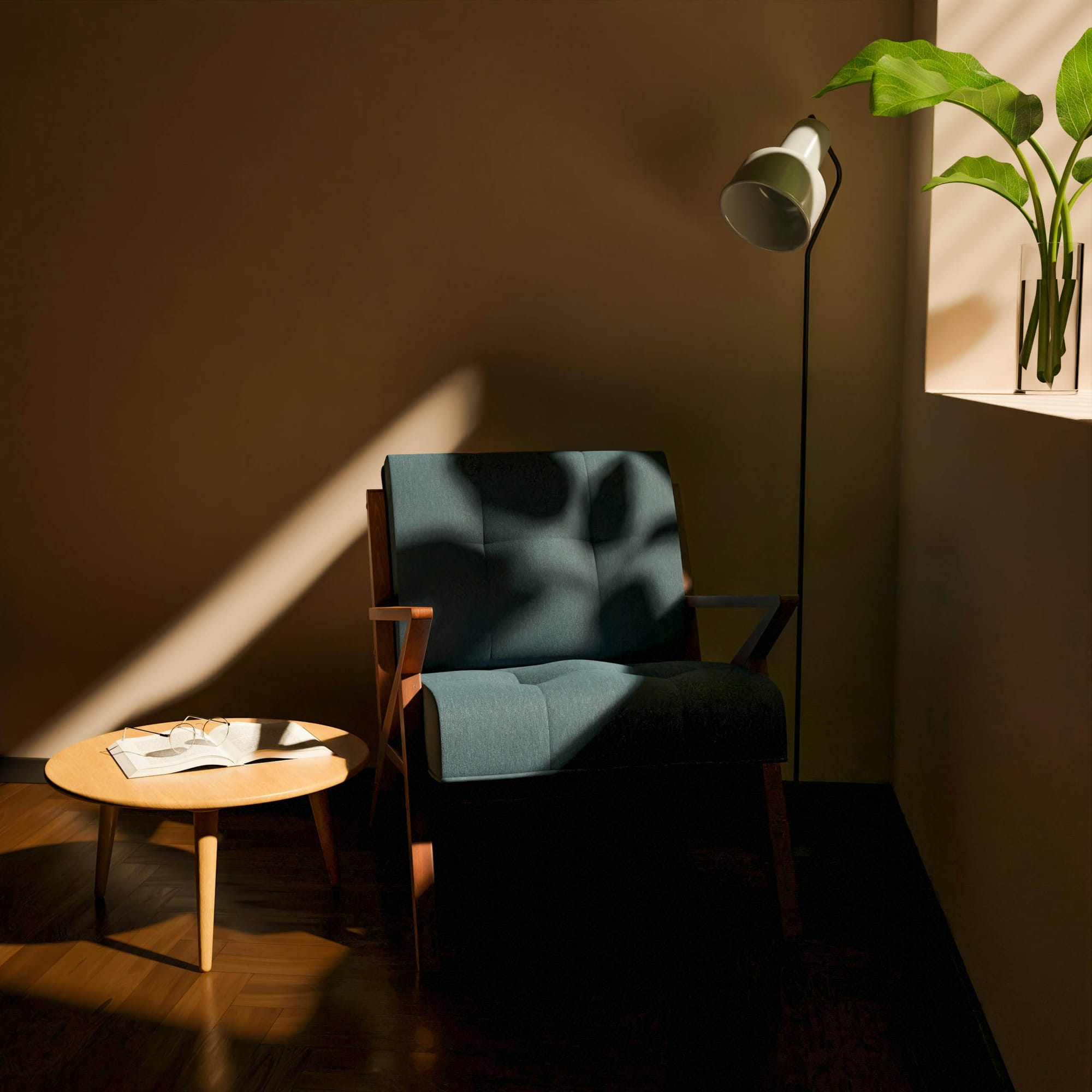
It is, by design, a singular seat. It does not invite company the way a sofa does. It implies intention — someone chose to sit here, alone, with a book or a thought or nothing at all. Placed correctly, an armchair doesn't just occupy a corner; it defines it. It tells you what that corner is for.
The classic wingback form — deep seat, high back, generous arms — persists because it works. It creates a microenvironment within a room: a contained, sheltered space that feels private even in an open plan. The high back cuts visual noise. The arms provide boundary. The body settles in and the room, for a moment, gets smaller in the best possible way.
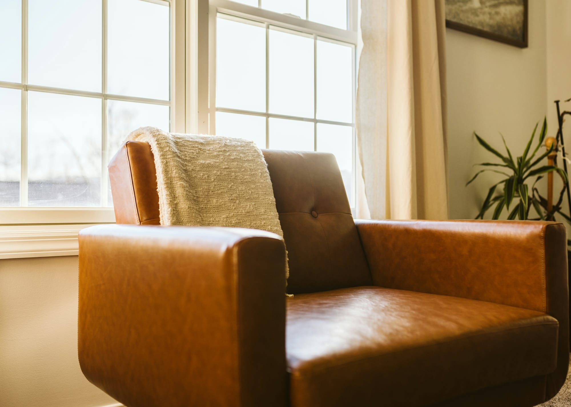
What you drape over the back matters too. A throw — especially one in a contrasting color, something warm against a cool upholstery — softens the formality of the form. It signals that the chair is used, loved, lived in. That this is not a showroom but a home.
The Palette of Restraint
The rooms that photograph most beautifully are rarely the most colorful ones.
There's a particular palette that recurs in the interior work that endures: cool neutrals — greys, slate blues, warm whites — punctuated by a single accent of warmth. Terracotta. Burnt orange. Ochre. One color that holds heat while everything around it stays composed.
It's a palette borrowed, consciously or not, from the natural world. Stone and shadow and a single point of fire. It works because it mirrors something the eye already knows — the way late light falls warm against a cool wall, the way an ember glows against ash.
The discipline is in the restraint. One warm accent, used decisively, does more than five competing ones. The eye needs somewhere to land.
What the Room Is Really For
There is a question that good interior designers ask early and often, and that clients sometimes struggle to answer: what do you actually want to feel in this room?
Not what do you want it to look like. What do you want it to feel like.
Because the two are not the same, and the confusion between them is responsible for most interiors that look right in photographs and feel wrong to live in. A room can be visually perfect and emotionally inert. It can win awards and fail its occupants.
The rooms that succeed — that become the ones you return to, that you describe to people when you're trying to explain why a house felt like a home — are the ones designed around an honest answer to that question.
Most of the time, when people answer honestly, the answer is some version of the same thing.
I want to feel like I can stop.
This article is part of our ongoing series on design, space, and the way we inhabit the world.
